Friday, December 28, 2007

On Blogs and Frogs

[Cross-posted to Cliopatria & Digital History Hacks]

Last week some time, my eyes popped open in the middle of the night and I realized that it's been quite a while since I blogged. I was too tired to get up and rectify the situation, but, of course, that didn't stop me from lying there half-awake and thinking about blogging. My mind turned to the fact that I've been even more remiss about cross-posting to Cliopatria from time to time. I imagined that some Cliopatrians (O.K., Ralph E. Luker) were probably posting more than a hundred times for each one time that I managed to.

From there I got to thinking about the students in my digital history grad class. They have to blog as the written component of their coursework. Although I'm very explicit about my preference for quality over quantity, you'd think that they would be motivated to produce approximately the same amount of written work as one another. Nevertheless, I had a sense that there could easily be an order of magnitude difference in output between the most and least-frequent posters. I tried to visualize what the distributions would look like: probably a power law. Since that night, I've had a chance to check. The figure below shows the number of times that various members of Cliopatria and of my grad class posted between the beginning of September and now.
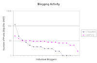


I think most academics, including my students, quickly learn that they have strong preferences for some kinds of writing rather than others. One person likes to write abstruse monographs, one popular books, one carefully-crafted essays. Some of us have found that we're able to blog and some people seem to be especially good at it. There's an ecology of scholarly production, and we all have to find our niche.

So I was lying there thinking about blogs and I realized that it reminded me of something, what was it? Oh yeah, frog communication. (It was the middle of the night.) Many years ago I read an utterly charming paper on the subject in Scientific American, and it's stuck with me (Peter M. Narins, "Frog Communication," Sci Am, Aug 1995, 78-83). In its efforts to attract females, the male coqui, a tiny Puerto Rican frog, makes a chirping call that is louder than a jackhammer. This raises many questions, not the least of which is "how [does] such a small creature protect itself from its own racket?" The answer turns out to be a fascinating lesson in evolution and engineering, so be sure to read the paper. What's interesting from the point of view of blogging, or scholarly production more generally, is that the frogs also have a special neural mechanism that follows the periodic calls made by other creatures, predicts windows of relative silence, and allows them to blast their own calls into the gaps.

Now based on my own experience to date, I rarely blog in response to external factors. Instead, I blog when I can get up the gumption to do so. Like many scholars, I've grown used to the idea that when you write something, you're adding it to a body of knowledge that is growing, if not monotonically, at least pretty steadily. On that view, the relative timing of different contributions doesn't matter so much, unless you're in a race for the Nobel prize or something. As historians, we can usually afford to take the long view.

Frogs, however, don't take the long view. As Charles F. Hockett argued in another classic Scientific American article, human language is apparently unique among animal communication systems because it allows us "to talk about things that are remote in space or time (or both) from where the talking goes on" ("The Origin of Speech," Sci Am, Sep 1960, 89-96). For the frog, there's right here, right now, give or take a few hundred milliseconds to squeeze in the call where it is most likely to be heard.

Thinking about blogging as a contribution to an infinite archive pushes us a bit too close to the frog's view of the world for comfort. Imagine having to squeeze your post in right here, right now, the only place where it has a hope of making any difference for anybody. The history blogosphere is already too vibrant, too far-flung for most people to monitor effectively. As more voices are added to the cacophony it's going to become harder and harder to be heard. How can we hope to get it right? Here's where we have a real advantage over the frog. We have the ability to create machines which simulate neural and evolutionary processes. Imagine the blogger of the future, augmented by an artificial system that monitors discourse, predicts gaps and pops in your contribution when and where it's most likely to be cited. Over time, the system learns what you are capable of, and becomes more effective at getting your message out. Does that sound crazy? Ribbit!

Tags: | | | |

Monday, December 03, 2007

Geo-DJ, Part 1: The Idea

In some of my earlier research on what I called place-based computing, I used handheld and tablet computers with GPS receivers to present archival materials to historians during fieldwork. Say you are standing in front of an old building. The system uses the GPS to determine your location, which is plotted in a geographic information system (GIS). The GIS layers include georeferenced historical maps and aerial photographs, so you can see what was around your present position (or thought to be around your position) when those historical representations were created. The GIS also includes hyperlinks to other kinds of historical sources, like photographs of buildings and streetscapes, census returns, newspaper articles, city directories, and so on. You can click on a digitized source to consult it, comparing it with the material sources that accumulate naturally in the archive of place. The system tested pretty well for individual researchers and small walking tours, although our prototypes were not very robust, had relatively short battery lives and could be difficult to read in direct sunlight.

The system that I am designing now, the geo-DJ, expands this work into an ambient, auditory dimension. Imagine walking around outside with an iPod-like device that is playing an electronic soundtrack. The music changes as you move, reflecting the historical land use patterns of the area that you are exploring. You may choose to represent patches of original forest with a flute, a dairy farm with bass viol and cow bells, a factory with a percussion ensemble, a slaughterhouse with discordant horns. As you walk towards the site of an old factory, the sounds of percussion rise in volume to dominate the music. Like the earlier place-based systems, the geo-DJ includes a GPS receiver and is based on GIS technology. The system determines your present position, then calculates distance and direction from the centroids of the historical features of interest. That data will then be used to mix the audio tracks that represent each feature.

At the moment, I'm working with a number of different hardware designs. The easiest ones to build will make use of the same handheld / GPS / GIS platform that I used earlier. I'm also experimenting with using dedicated audio hardware and microcontrollers like Arduino. Although I envision using the system as a history appliance, many other applications are possible. I'll be posting software and hardware notes here for other people who want to hack the geo-DJ.

Tags: | | | | | | |

Tuesday, November 20, 2007

Physical Computing Cards

In most public history graduate programs (including the one that I teach in) students get a good grounding in presenting history to the public in the form of images, texts and objects of material culture. Our program, like a growing number of others, also emphasizes the public historian's need to be able to communicate using various new media. Each year we try to add new tools and new techniques. The digital world is, of course, changing much faster than we can keep up with; typical undergraduate curricula change a lot less rapidly than I'd like. Our students respond to the challenge in various ways. Some seem to dislike drinking from the firehose while others are more willing to take it in stride.

I don't think that the idea of simply presenting history goes far enough, however. Over the past few years, I've begun to think of the public historian's problem as one of interaction design. When we've done our job, we will be able to describe not only how members of the public respond to our work, but how our work responds to them. It will be appropriate, in other words, to think of our work in terms of how it behaves.

For my long-suffering students, this means the need to learn more about computers than many would prefer. The computer, after all, is the most behaviorally plastic artifact that has ever been created. If we can specify an interaction algorithmically, we can implement at least part of it on a computer. Public history, however, is conducted in a number of venues and settings that make it impractical to use a desktop or laptop computer. In previous years the public history students, some colleagues and I have used GPS-enabled handheld computers to move pieces of the archive into the field (more information here). This year, I'm trying to expand our repertoire to include the use of microcontrollers and transducers, an approach that is nicely covered in O'Sullivan and Igoe's Physical Computing and Igoe's new Making Things Talk.

Most of my students have had little or no exposure to electronics and don't really have a sense of how to put off-the-shelf hardware modules together to create useful effects. We don't have a workshop space where people can solder (at least not yet) and don't have enough equipment for each student to build his or her own project. To get around some of these difficulties, I decided to create a collection of cards that can be laser printed on business card stock. Each card shows a picture of a device and has little glyphs along the sides that indicate how it can be combined with other devices. The basic scheme is laid out like this:


I'm planning to use the cards in studio by talking through some of the basic principles of physical computing and describing how particular effects or installations might be created. Suppose, for example, that you wanted a museum exhibit to sense the presence of a viewer, try to figure out if it was a child or adult, and adjust the wording of the artifact captions accordingly. One way to implement something like that would be to use force sensitive resistors hidden in a floor mat to determine the person's weight, and establish one or more thresholds to set an appropriate caption, which would then be displayed on an LCD. All of the computation could be done onboard a microcontoller module like Arduino. Using these cards to create a block diagram the system might look something like this:


Having explained a bit about how each module works, I can then pose a series of increasingly difficult design challenges and talk through their ideas with them. How would you make a light come on to illuminate a panel when someone approaches?


Given our available equipment, the designs can be more elaborate. How would you build a Wii-style wireless remote into a replica of some historical scientific apparatus? One possibility might look something like this:


PDF pages of the cards that I've made so far are here (8Mb). If you are interested in printing your own, you can contact me for a zipped file of the JPEGs of individual cards.

Tags: | | | | |

Tuesday, November 13, 2007

How To: Make a Museum Exhibit Mockup with Free Tools, Part 3

In the previous parts (1, 2) we built a 3D model of an imaginary museum exhibit in Google SketchUp and then created some views of it to use in a presentation to potential clients. Those views showed the geometry of the exhibit space, but not much more. Now we are going to use The GNU Image Manipulation Program (GIMP) to modify one of these views to create a more compelling vision of what the exhibit could be like.

The museum exhibit that I'm using for this demonstration is entirely made up. I'm going to say that it is about video arcade games in the late twentieth century, with a focus on technology and culture. Since I don't have any images or artifacts, I'm going to have to use ones that are already online. I don't want to violate anyone's copyright, so I need to search for images that have a Creative Commons license. I search Flickr for photographs of "video game", "arcade game" and other likely terms, and save links to ones that look promising.

Software packages like The GIMP, or its commercial cousin Adobe Photoshop, allow you to manipulate almost every aspect of an image and to combine multiple images into one by compositing layers. Think of this as working with a stack of transparencies. You can manipulate different pieces of your image on different layers, and when you are ready to produce a final image, you merge them all together. In its simplest form, this compositing process stacks up the images and figures out what is visible from the top and what isn't. More sophisticated techniques allow you to use the contents of one layer to influence another. This will become more clear as we go along.

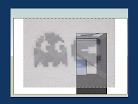
Let's start with the image of the entrance that we created last time. We open the file in The GIMP. I also want to use an image of a PacMan graffito from Barcelona, so open that in The GIMP too. Starting with the graffito, use Select->All and Edit->Copy to put a copy on the clipboard. Now go to the entrance image and use Edit->PasteInto to plunk it into the middle. It doesn't look very good at the moment, but don't worry about that. If you look at the Layers window in The GIMP you will see that you now have a Background layer (the image of the entrance) and a new Floating Layer on top of it. If you use your cursor to select the floating layer, and drag the Opacity slider to the left, you will see what you just pasted start to become transparent, so you can see the underlying layer through it. With 50% opacity, the two images look like this:


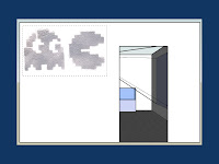
What we want to do is move the two little figures left and up, scale them appropriately, and blend them so they look more like they are painted on the wall near the entrance. First use the Scale tool on the graffito layer and make it about 67% of its original size. Then Move it into the place where you want it. Next use the Crop tool to trim the space around the two figures. Check the "Current layer only" box, draw a rectangle around the figures, and press Enter. If you make a mistake, undo it. Go to the Layers window, and where it says Mode: Normal, choose Mode: Hard Light. Your image should look something like this now:


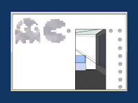
Next we want to create some "pills" (the kind that Pac Man ate) and we want the texture to match our two monsters. Go to the window with the original grafitto and Select a circular region of painted wall, copy it to the clipboard. Return to the image we're working on, create a New Layer, and use the PasteInto command to paste eight or nine copies of the circle into it. As you paste each, use Move to arrange them in a row of pills running down the right side of the entrance way. Adjust the opacity and mode to match the two monsters. My version now looks like this.


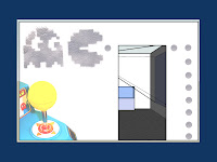
It still needs a bit of pizzazz. Let's add an image of a joystick to the lower left hand corner. Create a new layer and paste the joystick into it. Align it in the corner, then use the Crop tool to remove the other controller from the original photo, and anything that is overlapping the edges of the museum wall. Now you can use the Fuzzy Select tool to remove the background from the joystick picture. Once you've upped the Brightness and Contrast of that layer, you end up with something like this:


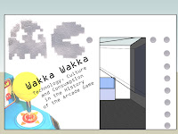
Now we want to add some text to title our exhibit. Let's call it "Wakka Wakka: Technology, Culture and Consumption in the History of the Arcade Game." Choose the Text tool, pick the OCR A Extended font, size 60 pixels, centered. Create a new layer and type the title. Use Layer->DiscardTextInformation to turn the text into a regular layer, and rotate the text so it is at an angle. Create another layer with the subtitle, using a 30 pixel font. Use the Hard Light mode to composite both text layers. My final version looks like this:


Using similar techniques, it is possible to modify the other SketchUp stills so they suggest what the exhibit will be like. I was originally planning to do all of the exhibit views but ran out of time, so I will have to save that for another day.

Tags: |

How To: Make a Museum Exhibit Mockup with Free Tools, Part 2

In the first part we made a simple 3D mockup of an imaginary museum exhibit using the freely available Google SketchUp tool. The great thing about 3d modeling is that it allows you to explore a space from various vantage points. For our purposes, two points of view are particularly important. First, how can we best show off this space to a potential client? We want to find views that can convey the unity of the big picture, and ones that emphasize individual highlights. The second collection of vantage points that we have to consider, of course, are those of the museum visitors. This means figuring out the most likely path through the space and the places where someone is probably going to stop, to look at something or to read a panel. The professional version of SketchUp (the one that you pay for) allows you to create animated walk-throughs which can be particularly convincing.

Here we'll stick with free tools, so we are going to think of our next step as creating a storyboard. Our goal is to turn a full three-dimensional world into a linear narrative and an accompanying series of two-dimensional still shots, not something that most historians are trained to do. I've found books like Understanding Comics and Film Directing: Shot by Shot to be very useful resources for the process of storyboard design.

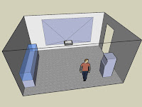
Start SketchUp and load the exhibit mockup. Start The GIMP while you're at it. For the exhibit proposal that we're making, we are going to want one shot that shows the whole space at a glance. This should be elevated enough so that it won't be confused with any realistic vantage point within the exhibit. We want to suggest a microcosm, and, by implication, a powerful viewer. In SketchUp, use the Orbit tool to get a view into your space that shows the interior walls and is looking down from a relatively steep angle. Now choose the Zoom tool, type 55 and press Enter to get a wide field of view. Click Zoom to Extents so that your space fills the screen. You can try adjusting angles until you get a view you like.

Next you are going to output some 2D pictures of your space as JPEG files. JPEG images are compressed, which means that they are small and easy to work with, and usually of good enough quality for online presentation. For archival work, or if you were planning to print your images, you would probably use Tagged Image Files (TIF) instead. The TIF format retains a maximum amount of information, which means that the images are often very large but of high quality.

If you are happy with your view, use File->Export->2DGraphic to create a JPEG. Use the Options button to set the image size so that (a) the width is 1024 pixels and the height is a little greater than 768 pixels, OR (b) the height is 768 pixels and the width is a little greater than 1024 pixels. What you don't want is a situation where the width is less than 1024 or the height less than 768 or both. You can monkey around with this until you see what I mean. Save your JPEG and then go to The GIMP and open it up. Ignore any warning messages you get; the software will do the right thing with your file.

In The GIMP, choose Image->CanvasSize. The width and height of the file are shown at the top, joined together on the right by a little chain. If you try to change one value, the other changes automatically, because the two values are chained together. Click on the Chain to break the link. Set the width to 1024, the height to 768 and click Resize. Now choose File->Save and click Export. This will save your file with the new dimensions. Use File->Close to close the image in The GIMP. Go out to Windows, right-click on your file and choose Properties. Click the Summary tab, and the Advanced button. It should confirm that your file is 1024 x 768 with 72 dpi. It is a good idea to get in the habit of keeping track of the properties of your image files. My first view looks like this:


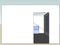
We now want to generate some views that are more representative of what the visitor would see. First, we want a shot of the view from outside the entrance. Choose Camera->StandardViews->Right and export a JPEG of the view. Mine looks like this:


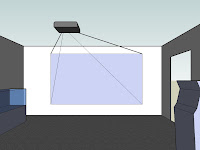
As the visitor enters, I'm going to assume that his or her attention is drawn first to the projected image. (At this point Bryce might be getting in the way. You can try moving him around the space and orienting him appropriately, or simply drag him out of the way, which is what I did.) Choose Zoom and set the field of view to 65 degrees. Then choose Camera->StandardViews->Front. We want to give more of a feeling of immersion with this view, so choose Camera->Walk, put the cross hairs on the front edge of the carpet and click. Then you can use the UpArrow on the keyboard to move into the scene at the right eye level. When you're happy export a JPEG. Mine looks like this:


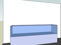
Next we want to show a view of the display case. Click on the carpet near the kiosk, and use the UpArrow and LeftArrow on the keyboard to 'walk' around the scene until you get a good view. When you've got it, export a JPEG. Here's mine:


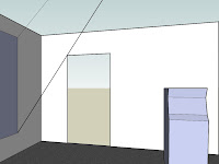
Finally, I'm imagining that the visitor will check out the kiosk before moving into the next gallery. Continue to use the Walk tool to move around the scene until you get a good view looking back at the kiosk. Export a JPEG. Mine looks like this:


We now have five images of our space to use in the presentation. At this point they are still quite plain. In the next part we will use The GIMP to modify these images to convey more of our vision for the exhibit.

Tags: |

Monday, November 12, 2007

How To: Make a Museum Exhibit Mockup with Free Tools, Part 1

Many people who make their way into public history find themselves in the position of having to impress a potential client without necessarily having many resources to do so. They may need to submit a proposal for a museum exhibit, for example, without being able to afford the services of a graphic designer. While it's always nice to get professional assistance, it's also nice to know that you can use freely available tools to create something a little slicker than a sketch on the back of an envelope. In this post and the next, I'll show you how to create a simple 3D model of an exhibit that you can build into a proposal or presentation. For the purposes of this demonstration, I want to focus on the digital tools, so the exhibit that I describe will be completely made up.

To follow along, you need to download and install two freely available programs, Google SketchUp 6 and The GNU Image Manipulation Program (GIMP). Both are available for Windows and Macs. Here I will give instructions for Windows; I assume the commands can be translated for Macs relatively easily.

First, you have to establish the dimensions of both your potential output and your exhibit space. Graphics files are typically described in terms of width, height and resolution. A common size for presentation on screen is 1024 pixels wide, by 768 pixels high, with a resolution of 72 dots per inch (dpi). If you want a larger or smaller image, keep the same resolution and the same 4:3 aspect ratio of width to height. Common sizes are 1600 x 1200 pixels, 1400 x 1050, 1024 x 768, 800 x 600, 640 x 480, 320 x 240 or 160 x 120. Newer monitors may have a different aspect ratio such as 5:4 or 16:9, but you are probably safest sticking with 4:3 unless you know what kind of monitor or projector your presentation will appear on.

If you plan to print your image on paper, you need to create it with a higher resolution, typically at least 240 to 300 pixels per inch (ppi). One of the challenges of working with graphics is that something that looks good on your screen can be underwhelming when you print it out, especially if you are trying to make a poster. Here I will assume we are creating something to be output on a computer screen.

Try to get blueprints and photographs of the exhibit space if you can. If not, make sure to get enough measurements that you can reconstruct the space. For my made-up example, I'm going to say that my space is 15' x 20' with a 10' ceiling. There is a 4' x 8' entrance in one of the 15' walls, and where one of the 20' walls would be there is actually an opening leading into another gallery. I have a ceiling mounted LCD projector to display on the 20' wall, and a display case (10' long x 4' high x 2' deep) along the 15' wall without the door. There will also be a free-standing kiosk with a 2' x 2' footprint that is 5' high, which I can move to an appropriate location in the room.

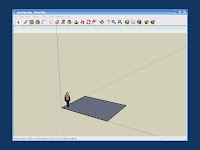
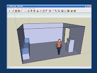
Given the dimensions of the space, we can use SketchUp to create a rudimentary 3D model. Start by using the Rectangle tool to draw the floor. To get the dimensions right, click on the origin and move the cursor into the plane, drawing a rectangle. You will see the dimensions in the lower right hand corner of the screen as you move the cursor. Type in 20', 15' and press Enter. The program should respond by drawing your floor. You can check your work with the Tape Measure tool to make sure the dimensions are right. Your mockup should look like this:


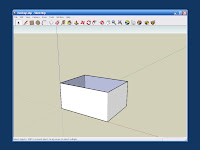
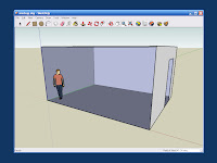
Now we want to create the basic volume of the space. Choose the Push/Pull tool (the one that looks like a block with a red arrow coming out the top), select the floor, hold down on the left mouse button and pull up a little bit. A cube should extrude upwards. Type in the distance (10') and press Enter. We'll want to be able to see into the space, so use the Arrow to select the top face of the cube, right click and choose Erase. If everything worked, you should see something like this:


Since one of the 20' walls opens into another gallery, we can erase it, too. Use the Rectangle tool to draw a 4' x 8' entry way in one of the 15' walls and use Move to slide it into the right position if necessary. Use the Arrow to select the door, right click and Erase it. Click the Zoom to Extents tool (a magnifying glass with four red arrows) and then type 45 to get a 45-degree field of view. When you press Enter the mockup should look something like this:


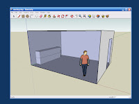
Now we want to create our display case. Unfortunately, the little dude who shows up by default is standing in the way. (His name is "Bryce.") Use the Arrow tool to select Bryce and then use Tools->Move to drag him out of the way. Now use the Rectangle tool to draw the 10' x 2' footprint of the display case along the wall. Use the Push/Pull tool to extrude it to a height of 4'. Since the top 2' of our display case is made of glass, we use the Pencil tool to draw a line around the midpoint of the case. The mockup now looks like this:


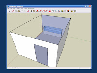
Next we use the Orbit tool to rotate the image around so that we can see the far side of the display case. Using the Paint tool, paint the top surface, and the left, front, and right top halves with transparent blue glass. Now that you can see into the case, it is obvious that we will need an internal platform to place artifacts on. Draw one with the Rectangle tool.


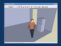
Next we create the kiosk. We use the Orbit and Zoom tools again to get a good view of where we want to put it. Draw the 2' x 2' footprint with the Rectangle tool, and then extrude it to a height of 5' with the Push/Pull tool. My imaginary kiosk looks a bit like a classic arcade-style video game. We use the Rectangle tool to draw a Golden Section on the front face, then the Push/Pull tool to push it in about 4".


This next bit is hard to describe, but easy enough once you get the hang of it. By selecting the horizontal lines on the front of the kiosk, we can use the Move tool to push them in or out gently, thus sculpting the front. If you do something too drastic, you can always Undo it. When finished, mine looked like this:


Next we want to place our LCD projector on the ceiling and indicate where the image will be projected. Rather than creating a projector model ourselves, we go to the Google 3D Warehouse and search for "projector". The one created by Rothmatic looks like what I had in mind, so we save it to disk and import it into the drawing.

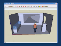
Use the Scale tool to make the projector the right size. Then Move it into the center of the ceiling and Rotate it to the right orientation. In this demonstration, I've just eyeballed it, but for a real exhibit you would want to know where the projector would be mounted, and how large and where exactly the image would be cast. You would want to make sure that most visitors wouldn't walk through the beam. You'd also have to worry about ambient lighting being high enough for comfort but not so high as to drown out the projected image. In the interests of pedagogy, however, we're making this up and simplifying as we go along. Use the Rectangle tool to draw the projected image on the wall, and the Pencil tool to draw lines from each corner of the projected image back to the projector lens. If all your lines connect, you will end up with a pyramid-shaped solid, as shown in the next image.


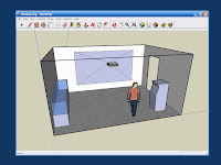
Now use the Arrow tool to select each face of the pyramid in turn, right-click and Erase them. Use the Paint tool to make the walls off-white, and the carpet gray. The final model should look like this:


We now have a basic 3D model which we can use to convey an impression of how the exhibit space will look. If you'd like to load the model into SketchUp and play with it, a copy is here. In the next part, we'll generate some screenshots of our space, and load them into The GIMP for further manipulation.

Tags: |

Friday, November 09, 2007

History Appliances: Laser Spirograph

A sure sign of a 1970s childhood is a fond memory of doodling with the Kenner Spirograph toy. In the back of my mind I've been thinking it would be fun to build something like it into a history appliance. You can already find software versions online, but I wanted something that could be used at the periphery, rather than the focus, of attention. On a recent trip to Active Surplus in Toronto I realized I could build a version quite cheaply. So here it is: a little too thrown together even to call a hack, this is really a kludge.

I started by cutting a $1 laser pointer out of its casing and soldering some wires to it so I could switch it on and off electronically. Here it is on a breadboard with a 5v voltage regulator.


The laser shines on a mirror that is crazy-glued to a cylindrical piece of dense foam and mounted on the shaft of a motor. I used Lego motors because I had a pair of them. The reflection bounces off another mirror, similarly mounted, and is projected on to a screen made from a 3x5 card. The motors tend to slip around when they are running so I put a rubber mat under each.


The motors are controlled by pulse width modulation, using a Phidgets MotorControl LV board. I used a wall wart to supply 9v for the motors.


To be able to fiddle with the speed of each motor, I used the Phidgets Interface Kit, the mini joystick and a Max/MSP patch.


The whole setup looked like this.


With the motors both running, the dot of the laser pointer is perturbed by first one rotation, then the next, tracing out a familiar spirograph-style image.


As you vary the speed and direction of rotation for the two mirrors, you get a range of different patterns.


To demonstrate, I used the joystick to vary the parameters of the system. In an application, it would be hooked up to streaming data instead. Groovy!

Tags: | | |

Sunday, October 28, 2007

Seams and the Suspension of Disbelief

At an unconference that I was at a few weeks ago, Lucy Suchman began a conversation about illusion and suspension of disbelief in technocultural systems. The example that she gave was animation: we really buy into the actions of lovable cartoon characters, and readily attribute intentionality to them. And yet, of course, there is nothing beneath the surface to match the imagined anthropomorph. Such suspension of disbelief seems to follow quite readily when the details are right. It's hard to look at the slowly pulsing LED of a "sleeping" PowerBook and not feel like the machine is a little bit more human for it.

Suspension of disbelief is something that historians strive for, too. In public history, for example, costumed interpreters, museum dioramas, and replicas of artifacts and documents stand in for the originals that they are intended to resemble, although they may have little or no causal relationship to them. The monographs of traditional history are also simulacra. They bear a principled relationship to past events, but have rarely partaken of them. Instead, their job is to put the reader into a some kind of relationship with the past, to get him or her to see through the physical reality of the codex.

The discipline of citation allows sophisticated readers to assess the evidentiary material from which a particular account is constructed. Each footnote serves as a kind of thread. Pulling on it may tighten a seam or rip it open. Professional historians expect the body of a work to be relatively smooth and tightly integrated, but they also expect to be able to use the footnotes to take it apart as necessary. Ideally, monographs always present both smooth and seamful faces.

In digital history, we have to pay attention to finding the right balance of smoothness and seamfulness, but we can work at a number of different levels, ranging from low-level electronic and hardware decisions to very high-level software abstractions. It is possible for something to appear smooth at every level. Carrying on the unconference conversation, Casey O'Donnell gives the examples of the iPod and Wii. As he says, "these devices (mostly) just work," and have been designed to suppress tinkering. It is possible, however, to construct systems that are smooth at one level and seamful at another, that signal their willingness to be hacked in particular ways. (See the work of Matthew Chalmers for more on explicitly seamful design). At the unconference, I demonstrated a simple musical instrument made from a distance sensor, Phidgets interface, a laptop running Max/MSP and a MIDI software synthesizer. All of the seams were out in the open--in fact it was a bit messy. But to play the instrument all you have to do is wave your hand in front of the sensor and you get glissandos of marimba notes. At the behavioral level it is fun and responsive; at the hardware and software levels it is obviously hackable.

As we develop historical projects online, we need to ask ourselves how we can incorporate tinkering while maintaining smoothness where we want it. A great recent example of this is Devon Elliott's suggestion that archives use wiki technology to allow historians and other researchers to create item-level metadata.

Tags: | | |

Sunday, October 21, 2007

The Archive as Time Machine

[Cross-posted to Cliopatria & Digital History Hacks]

Our story so far: even though we know that it's probably impossible, we've decided to think through the problem of building a time machine. In the last episode we decided that we wouldn't want one that allowed us to rewrite the past willy-nilly... because what would be the point of history then? It turned out, however, that the world itself is a pretty awesome time machine, tirelessly transporting absolutely everything into the future. Today we look at the archive widely construed: one small portion of the world charged with the responsibility of preserving our collective representational memory.

As every schoolboy used to know (at least back when there were 'schoolboys' who knew the Classics), Thucydides wanted his work to be "judged useful by those inquirers who desire an exact knowledge of the past as an aid to the interpretation of the future ... an everlasting possession, not the showpiece of an hour." The fact that we know this twenty-five centuries later speaks pretty well for the potential of preserving representations for long periods of time. Precisely because they can be readily transferred from one material substratum to another, written words, well, remain. Of course, since languages change over time there can be difficulties of decipherment or translation, and exactly which words survive can be a real crap shoot.

With the relatively recent spread of optical, magnetic, and other media, it became necessary to archive media readers, too. The endurance of the written word (or new cousins like photographs and phonographic records) now also depended on devices to amplify, transduce or otherwise transform signals into a form that is visible or audible to human users. Along with the obsolescence of media, librarians and archivists now had to worry about the obsolescence of reading devices.

Enter the computer. Representations are now being created in such quantity that the mind boggles, and they can be transformed into one another so easily that we've taken to referring to practically all media as simply "new." This, of course, poses librarians and archivists with a class of problems we could also refer to as "new." My students and I were talking about this in my digital history grad class a few weeks ago. How do we store all of this born-digital material in a form that will be usable in the future, and not just the showpiece of an hour? One possibility, technically sweet but practically difficult is to create emulators. The archive keeps only one kind of machine: a general-purpose computer that is Turing-equivalent to every other. In theory, software that runs on the general-purpose machine can emulate any desired computer.

My students are most familiar with systems that emulate classic video and arcade games, so that framed our discussion. One group was of the opinion that all you need is the 'blueprint' to create any technological system. Another thought that you would be losing the experience of what it was like to actually use the original system. (Here I should say that I'm solidly in the latter camp. No amount of time spent on the CCS64 emulator can convey the experience of cracking open the Commodore 64 power transformer and spraying it with compressed air so it wouldn't overheat and crash the machine while you were hacking.)

More than this, however, the idea that a blueprint is all you need to recreate a technical system shows how much more attention is focussed on the ghost than on the machine these days. The showiness of new, endlessly plastic media obscure their crucial dependence on a systematic colonization of the nanoscale. I might be able to read a microfiche with sunlight and some strong lenses, but never a DVD. The blueprint for a DVD reader is completely useless without access to some of the most advanced fabrication techniques on the planet. So we're in the process of creating all this eternally-new stuff, running on systems whose lifecycles are getting shorter every year. What would Thucydides say?

Next time: how and why to send messages way into the future.

Tags: | |

Friday, October 12, 2007

Unoriginal

I'm in Montreal this week participating in the Playful Technocultures unconference and the annual meeting of 4S. I've met a lot of interesting people, learned about what's been going on in STS since I last dropped in, and had a number of thought-provoking conversations. For me, a lot of the discussion has centered on (artificial?) distinctions between play and work, on what makes something "serious" or not. Today, for example, I had lunch with three RPI guys, Hector, Casey and Sean. We were talking about the role of blogging in academic careers, how it is not yet valued for promotion or tenure, even though it is clearly a form of public engagement. Many of us, in fact, have already found our online reputations and readership to be at least as beneficial as our published work in providing access to scholarly opportunities, funding, and other good stuff. The academic perception of professional blogging is bound to change as a generation of academic bloggers becomes tenured, and committees begin to recognize that blogging may be fun, but it can also be work, that blogs can be about more than where you ate lunch.

Our discussion turned from there to the fact that bloggers tend to value substantive posts much more than short ones that link to other things of interest. Sean noted, however, that given the sheer volume of stuff that comes through the feed reader every day, these link posts serve a useful "buzz" function... you tend to check out the pointers that recur in the blogs that you follow regularly. In a sense, both the glut of information and the new value of "unoriginal" content (like link posts) are concomitants of the shift to what Roy Rosenzweig called the culture of abundance. There is way too much out there now to monitor by yourself; you really need other people to add their "me too" when someone thinks something is cool. Think of these link posts as providing a gradient to the search space, so you or your bots have a better chance of finding spikes of interest.

Don't get me wrong: I think originality can be a good thing, but I don't think that it's the only good thing. The internet gives us instant access to the contents of the hive mind. It's easy to find out that someone else has already had your brainwave, or done the hack that you were planning to try. Don't let that stop you. You have to play with other people's ideas, words, tropes, code, artifacts, instruments, and story lines to achieve any kind of mastery of anything. Besides, historians are fond of pointing out that every new new thing actually has a long past [insert unoriginal allusion to Santayana here]. Sure the collective is doomed to repeat things, but how else could it memorize them?

Tags: | | |

Thursday, September 27, 2007

Brainstorming History Appliances

This year I've added a studio component to my graduate course in digital history, so the students have a chance to learn some of the fundamentals of interaction design and apply them to their work in public history. In yesterday's class I gave them the task of brainstorming gadgets, appliances, devices, tools or toys that would somehow, magically "dispense history" or put their users in touch with the past in some other way. (The assignment is here). Many of the ideas that they came up with were really interesting. In no particular order, here are some of my favorites.

Heritage knitting needles. Passed down within a family, these needles take on the ability to guide their user in the re-creation of any pattern they've been used for in the past.

Tangible spray. This comes in an aerosol can. When you spray it in front of you, a grey mist appears. You can reach into the mist and feel the past for a few moments. When the mist dissolves, you're grasping thin air. You might get hooked on such an experience, and buy one spray can after another.

History hoe. Use this in your garden to grow heirloom or extinct plant species.

Yelling documents. You put your primary source into a machine like a microfiche reader. A stern, professorial face appears on the screen of the reader. As you make interpretations about the document, the reader will berate you in a British accent if you get something wrong. Hard to please, it only admits correct interpretations grudgingly, with harrumphing noises.

Reverse Babel Fish. Put on this hearing aid, and everyone around you starts speaking in Old English.

Not surprisingly, many of the ideas reworked themes familiar from fantasy or science fiction, like the talking genealogy hat a la Harry Potter (tilt the floppy brim to fast forward or reverse) or a "transporta-potty" that is like Dr. Who's phone booth (flush to reset). Some of them related to subjects of perennial interest to students, like the cabinet that dispensed historical cocktails with music appropriate to the period.

For me, part of the fun was asking the students beforehand about their interests, hobbies and skills. I'm not sure what role we will find for talents that include piano playing, gardening, belly dancing, horse riding, knitting and snowboarding... but I'm glad to know their imaginations are in good working order. There are links to all of their blogs on the course website.

Tags: | |

Monday, September 17, 2007

The Importance of Infrastructure

The architect Christopher Alexander is well-known for having developed the idea of patterns, each of which "describes a problem which occurs over and over again in our environment, and then describes the core of the solution to that problem, in such a way that you can use this solution a million times over, without ever doing it the same way twice." The idea was enthusiastically adopted by software engineers and is now found in various forms throughout the digital realm. One very interesting manifestation is the recent report by Thorsten Haas, Lars Weiler and Jens Ohlig on design patterns for "Building a Hacker Space."

This report is required reading for anyone who is interested in the transformative or disruptive potential of new technologies in academia. It describes ways of creating and sustaining spaces for people to hack in, by providing a series of problems and solutions. For example, "You have a chicken-and-egg problem: What should come first? Infrastructure or projects?" They suggest that you "Make everything infrastructure-driven. Rooms, power, servers, connectivity, and other facilities come first. Once you have that, people will come up with the most amazing projects you didn't think about in the first place."

This pattern fits in well with work in cognitive science that suggests that human reasoning and memory crucially depend on richly structured environments that are full of tools (e.g., Hutchins, Clark). In my own research, I've found that modest environmental changes can have significant effects that I couldn't have anticipated. When I was working in linguistic theory, for example, I had a chance to move into a new office where I installed a wall of whiteboards. Being able to see a lot of diagrams spread out in front of me changed my understanding of the material, making it much more visual, and suggested different research questions. When I was studying for my comprehensive exams, I splurged and bought an expensive ergonomic chair. Up to that point, I had always thought I was a fidgety person (too much coffee and Coca Cola), but now I could sit still and read for 8 or 9 hours at a time. I've recently had a chance to set up a study with my workbench directly behind my desk. Now I can rotate my chair 180 degrees and there is the soldering station, Dremel, multi-meter, audio equipment, Phidgets, bins of components, and so on. Having tools and supplies ready-to-hand makes it easier for me to imagine hacks that involve a hardware component.

Tools cost money, however, and most grants are resolutely project-driven and fenced in by disciplinary boundaries. In retrospect it is clear to me how whiteboards might make someone a better linguist, or a good chair a better student. I'm finding that a modest electronics lab is giving me a better understanding of the role of acoustics in history. It's hard to imagine convincing a granting agency of these things. Grants tend to be short-term and result-oriented. If you don't know what the benefit will be, or can't relate a particular piece of equipment to a particular result it is hard to make a convincing case for spending the money.

But some people get it. A few months ago I heard a poignant story from a Canadian researcher. He requested a lab that was tailored to his work, and ended up with an unsuitable boxy linoleum-floored room with computers facing four walls around the outside perimeter. He doesn't like the space and neither do his students. To make matters worse, a visiting researcher from Sweden showed them pictures of his lab, which looked like something from a design magazine. "That looks like a wonderful space," my friend said wistfully, "I wouldn't mind just hanging out there." "Yes," the visitor replied, "people come to hang out and end up working." Many of my colleagues treat Starbucks or other cafes as workplaces, finding them much more salubrious than their alloted space.

In Electric Sound, Joel Chadabe describes the London digs of an early 1980s synthesizer company. "Opening a single large wooden door ... one entered a large foyer, bare except for beautiful paintings, Charles Rennie Mackintosh furniture, and a wooden table off to one side behind which sat a receptionist. There were demonstration areas upstairs ('by appointment only, of course'), and there was a large cafe downstairs, with resident cook and waiter, for staff and customers. In an adjacent building, there was a garage to which selected customers were given automatic door openers so they could privately park their cars." 'We didn't always make corporately sensible decisions,' one of the owners told Chadabe, 'but had we been accountants we wouldn't have done it at all. You could buy innovative cutting edge technology in a private, comfortable environment. It was the sort of environment that we wanted to work in, so the natural assumption was that if we wanted to work there customers would want to come there. And they did. It was immensely successful.'

It's a pattern you can see over and over in the histories of science, technology, and the arts: the right infrastructure attracts the right people and then something really cool happens. But it isn't possible to predict in more detail than that.

Tags: | |

Monday, September 10, 2007

Sounds Like Sepia

One of the things that I was working on over the summer was finding more ambient ways to communicate historical knowledge. As part of that work, I've been recording soundscapes and have gotten in the habit of making a test recording outside my house before setting out. When listening to these test recordings the other day I noticed something odd. I could hear the sound of crickets and other insects, a distant car engine, snatches of music on the breeze, birds, the indistinct voices of children playing. Even though I had recorded the track only a few days earlier, I felt like I could be listening to any summer morning in my lifetime. Somehow the sounds had become unstuck from the time I recorded them and were lazily drifting around. Or so it seemed.

It's hard to investigate a feeling but I decided to give it a little more thought. When we are able to see something that is making noise we readily correlate the sound with the object. This can be disrupted a bit in cases where it takes the sound a noticeable amount of time to reach us, as when watching someone bat a baseball from a distance. We judge the distance of a sound source that we can't see in part by its amplitude--quieter things tend to be farther away--and in part by the environmental coloration that the sound has undergone. A sound that reaches our ears directly arrives there before reflections of that sound off of stuff in the environment. If the reflections arrive quickly, they change the timbre of the perceived sound. If they arrive slowly they are perceived as echoes. The ability to record a sound and play it back later makes it possible to create arbitrary temporal distance between the source of a sound and its perception.

What I got to wondering was whether environmental coloration might be used to make a sound seem as if it were coming from a more distant past. A visual analogy might be coloring a photograph with sepia tones (cheesy) or filtering the image to simulate the aging of old film (better). In order to experiment, I set up the following hack.

First, I built a simple circuit to generate a relatively pure tone using the handy 555 timer and a few other components. I set up a digital audio recorder right above the circuit and recorded a few seconds of irritating buzz. The rig is shown in the photo below... the white thing on the speaker is half of a Nalgene container that I used for a resonator. I've included the schematic in case you want to make your own. You can lower the pitch by increasing the resistance of the 100K resistor and raise it by decreasing the resistance.


When I recorded the sound of the tone generator right above the circuit it sounded like this (WAV file). I then moved the recorder to a position about 10 feet away, near an open window. Finally I moved it into another room about 20 feet away. Using Audacity, I amplified both of these recordings so that the overall sound level was the same as the first one (-21 dB). The recording made at an intermediate distance sounded like this (WAV file) and the one made at the far distance sounded like this (WAV file). Using the frequency analysis capability of Audacity, it is easy to see the effect of distance and noise on the subsequent recordings.


Does environmental coloration make the sound seem more distant in time as well as space? I'm not sure. I thought I'd put it out there in case anyone else has the same perception, or wants to hack the hack.

Tags: | | |

Saturday, September 01, 2007

A Plea for Concept Projects

I'm the first person to admit that I know nothing about fashion, so I could be wrong about this... but my understanding is that the things to be seen on the runways of Paris, Milan or New York are not really intended to be worn. The point of taking attractive (if emaciated) people and dressing them up like samurai and astronauts, or festooning them with lanterns, is to stimulate the imagination. Designers have a space to convey a sweeping vision without worrying too much about practicality, and their public is drawn to their more quotidian offerings by having a sense of a bigger picture. Automotive engineers, too, have a tradition of creating concept cars: one-of-a-kind prototypes that push the boundaries of particular forms, get ideas into circulation, and draw attention to the imagination and technical expertise of their creators.

Academic historians (and many other humanists and social scientists) don't really have a tradition of creating projects that are not meant to be judged primarily in terms of utility or veracity. But we can't complain that our research is treated as marginal unless we are willing to make some effort to put our thinking into forms that are of interest to other audiences than our close peers. I'm not suggesting that scholarly traditions be weakened in any way, just that we create some new traditions.

Digital scholarship puts very few restrictions on form and makes it easy to reach a potentially vast audience almost instantly. And yet most new projects offer only incremental advances over the pre-digital state of the art, if that. It's time to make some space for concept projects, to put work out there because it's visionary or beautiful or wacky or reflexive or just, as Thoreau put it, because it "affects the quality of the day."

Tags: | |

Monday, August 27, 2007

Some Varieties of Time Machine Worth Having

[Cross-posted to Cliopatria & Digital History Hacks]

I've been invited to join the crack team of bloggers at Cliopatria, so I will be cross-posting there and at Digital History Hacks from time-to-time. I'm excited by the opportunity to develop a series of posts on a topic of general interest to historians, while keeping enough technical content to satisfy my regular readers. So... let's build a time machine!

At some point in the early nineties I copied down a quote by Loren Eiseley in a commonplace book:

A man who has once looked with the archaeological eye will never quite see normally again. He will be wounded by what other men call trifles. It is possible to refine the sense of time until an old shoe in the bunch of grass or a pile of nineteenth-century beer bottles in an abandoned mining town tolls in one's head like a hall clock. This is the price one pays for learning to read time from surfaces other than an illuminated dial. It is the melancholy secret of the artifact, the humanly touched thing. The Night Country 1971:81.


I made a note of the source, but not how I came upon it. I know I wasn't reading Eiseley's work because I used to keep lists of the books that I read. At the time I was studying linguistics and cognitive science, and in the early summer of 1994 I dipped into ecological anthropology. I assume that I came across the quote then. Now I don't really remember the context as clearly as it sounds. I'm making inferences from my old notebooks and from Usenet posts that have been archived online for 15 years. Reading through those old posts reminds me of what I was doing at the time, although I remember being quite a bit cooler than some of my posts make me sound. I wish that that were my own melancholy secret, but at some point in the 1990s I realized that everything that I had ever typed into a computer was going to be saved forever and eventually made available to everyone.

The Eiseley quote stuck with me, and occasionally I would imagine what it would be like to have an 'archaeological eye.' Being given more to science fiction than fantasy, I tended to imagine a mechanism or instrument or device of some sort, rather than a magical object like a crystal ball. Now at this point I should probably stop and reassure you that I know that it may well be impossible to build a time machine in general, and that it is certainly impossible for me to build one. But I think it can sometimes be quite productive to start with something that you know is impossible, and think through some of the implications anyway. As a genre, fiction is ideally suited to this kind of gedankenexperiment; academic monographs less so. Blogs lie somewhere in between. As my fellow Cliopatrian Timothy Burke once wrote, a blog is an ideal "place to publish small writings, odd writings, leftover writings, lazy speculations, half-formed hypotheses." Plus, time machines are a heck of a lot of fun.

When most people think of a time machine, I suspect they probably imagine something like the H. G. Wells version: jump in, set the dial to whenever, hit a button and you are there. This kind of time machine allows (or requires) you to alter the course of events. Sometimes the results are tragic. In the classic Ray Bradbury story "A Sound of Thunder," one of the characters steps on a prehistoric butterfly and changes the future decidedly for the worse. Sometimes the results are comic, as in Connie Willis's re-take of Jerome K. Jerome. A skeptic might point out that if this kind of time travel were ever going to be possible, we'd already be surrounded by people whizzing back from the future to take our fresh water or oxygen, or buy stock in Google, or exhort their younger selves to study harder, or whatever. For historians, the real problem with being able to alter the past is that it would seem to allow for Bill & Ted-style rewriting on a grand scale, and thus make history utterly pointless. The mutability of history, after all, crucially depends on the immutability of the past.

In fact, physicists are split on the possibility of time travel. Some of those who think time travel might be possible suggest that there could be some law of physics that prevents the creation of weird causal loops--you know, the kind where you go back in time to become your own great-great-grandfather or -mother. Stephen Hawking, for example, postulates a "chronology protection conjecture." (For more, see the article by Paul Davies in Scientific American or his subsequent book.) So when I think of an 'archeological eye' I usually imagine something more voyeuristic: the ability to see or hear or in some way measure the events of the past without affecting the outcome.

Years later, let's say around Y2K, I was studying history. Reading Carlo Ginzburg's essay "Clues" reminded me of the Eiseley quote once again. Wouldn't it be cool to write a history based on virtuoso readings of material evidence? (Like Ginzburg, I read a lot of Sherlock Holmes as a kid.) Unfortunately, the only thing that I was arguably a virtuoso at reading was books, and even that was a stretch. Fortunately I was also reading the work of New Institutional Economists at the time. My head was full of ideas of information costs and transaction costs. Since it costs something to learn something, we can never know very much. I had about the same chance of learning to read old shoes or nineteenth-century beer bottles as I did of learning to read sheet music: fairly low. Choosing to specialize in reading one kind of material evidence would preclude learning to read an almost infinite number of other kinds of traces.

What to do? The key word is 'specialize'. As with other kinds of work, there is a division of interpretive labor. In order to make use of material trace evidence, you don't necessarily need to be able to read it yourself, you simply need to be able to find someone who can. With the traditional tools of scholarship it would have been very difficult to assemble a synoptic view of other people's reconstructions of the past from physical evidence. The emergence of search engines like Google drastically lowered those information costs, however. If you type interpret "wear marks" into Google, you will find a reference to a 1958 paper in the British Chiropody Journal on using shoe wear marks to diagnose foot troubles. You'll find a white paper on how to use scattered light to assess surface and bulk defects in various materials, a paper on the use-wear of stone tools, and so on. You'll find, in other words, a world of chiropodists, materials scientists, forensic scientists, engineers, archaeologists and thousands of other kinds of specialists busy reconstructing the past from its material traces. These are people in search of usable past. They care about past events because they have consequences in the present, and the only way they can access that past is by looking for its indexical signs. These experts don't always agree with one another; the mutability of history also depends on the fact that learning is costly. But since our environment is comprised entirely of survivals from the past, it is a kind of time machine, constantly transporting everything from some past into the present. It is one kind of time machine that is worth having... even if it does seem to work in one direction only and is remarkably difficult to use. (For more on the idea of the environment as an archive of material traces see my new book The Archive of Place.)

Next time: the archive as time machine.

Tags: | |