Tuesday, November 20, 2007

Physical Computing Cards

In most public history graduate programs (including the one that I teach in) students get a good grounding in presenting history to the public in the form of images, texts and objects of material culture. Our program, like a growing number of others, also emphasizes the public historian's need to be able to communicate using various new media. Each year we try to add new tools and new techniques. The digital world is, of course, changing much faster than we can keep up with; typical undergraduate curricula change a lot less rapidly than I'd like. Our students respond to the challenge in various ways. Some seem to dislike drinking from the firehose while others are more willing to take it in stride.

I don't think that the idea of simply presenting history goes far enough, however. Over the past few years, I've begun to think of the public historian's problem as one of interaction design. When we've done our job, we will be able to describe not only how members of the public respond to our work, but how our work responds to them. It will be appropriate, in other words, to think of our work in terms of how it behaves.

For my long-suffering students, this means the need to learn more about computers than many would prefer. The computer, after all, is the most behaviorally plastic artifact that has ever been created. If we can specify an interaction algorithmically, we can implement at least part of it on a computer. Public history, however, is conducted in a number of venues and settings that make it impractical to use a desktop or laptop computer. In previous years the public history students, some colleagues and I have used GPS-enabled handheld computers to move pieces of the archive into the field (more information here). This year, I'm trying to expand our repertoire to include the use of microcontrollers and transducers, an approach that is nicely covered in O'Sullivan and Igoe's Physical Computing and Igoe's new Making Things Talk.

Most of my students have had little or no exposure to electronics and don't really have a sense of how to put off-the-shelf hardware modules together to create useful effects. We don't have a workshop space where people can solder (at least not yet) and don't have enough equipment for each student to build his or her own project. To get around some of these difficulties, I decided to create a collection of cards that can be laser printed on business card stock. Each card shows a picture of a device and has little glyphs along the sides that indicate how it can be combined with other devices. The basic scheme is laid out like this:


I'm planning to use the cards in studio by talking through some of the basic principles of physical computing and describing how particular effects or installations might be created. Suppose, for example, that you wanted a museum exhibit to sense the presence of a viewer, try to figure out if it was a child or adult, and adjust the wording of the artifact captions accordingly. One way to implement something like that would be to use force sensitive resistors hidden in a floor mat to determine the person's weight, and establish one or more thresholds to set an appropriate caption, which would then be displayed on an LCD. All of the computation could be done onboard a microcontoller module like Arduino. Using these cards to create a block diagram the system might look something like this:


Having explained a bit about how each module works, I can then pose a series of increasingly difficult design challenges and talk through their ideas with them. How would you make a light come on to illuminate a panel when someone approaches?


Given our available equipment, the designs can be more elaborate. How would you build a Wii-style wireless remote into a replica of some historical scientific apparatus? One possibility might look something like this:


PDF pages of the cards that I've made so far are here (8Mb). If you are interested in printing your own, you can contact me for a zipped file of the JPEGs of individual cards.

Tags: | | | | |

Tuesday, November 13, 2007

How To: Make a Museum Exhibit Mockup with Free Tools, Part 3

In the previous parts (1, 2) we built a 3D model of an imaginary museum exhibit in Google SketchUp and then created some views of it to use in a presentation to potential clients. Those views showed the geometry of the exhibit space, but not much more. Now we are going to use The GNU Image Manipulation Program (GIMP) to modify one of these views to create a more compelling vision of what the exhibit could be like.

The museum exhibit that I'm using for this demonstration is entirely made up. I'm going to say that it is about video arcade games in the late twentieth century, with a focus on technology and culture. Since I don't have any images or artifacts, I'm going to have to use ones that are already online. I don't want to violate anyone's copyright, so I need to search for images that have a Creative Commons license. I search Flickr for photographs of "video game", "arcade game" and other likely terms, and save links to ones that look promising.

Software packages like The GIMP, or its commercial cousin Adobe Photoshop, allow you to manipulate almost every aspect of an image and to combine multiple images into one by compositing layers. Think of this as working with a stack of transparencies. You can manipulate different pieces of your image on different layers, and when you are ready to produce a final image, you merge them all together. In its simplest form, this compositing process stacks up the images and figures out what is visible from the top and what isn't. More sophisticated techniques allow you to use the contents of one layer to influence another. This will become more clear as we go along.

Let's start with the image of the entrance that we created last time. We open the file in The GIMP. I also want to use an image of a PacMan graffito from Barcelona, so open that in The GIMP too. Starting with the graffito, use Select->All and Edit->Copy to put a copy on the clipboard. Now go to the entrance image and use Edit->PasteInto to plunk it into the middle. It doesn't look very good at the moment, but don't worry about that. If you look at the Layers window in The GIMP you will see that you now have a Background layer (the image of the entrance) and a new Floating Layer on top of it. If you use your cursor to select the floating layer, and drag the Opacity slider to the left, you will see what you just pasted start to become transparent, so you can see the underlying layer through it. With 50% opacity, the two images look like this:


What we want to do is move the two little figures left and up, scale them appropriately, and blend them so they look more like they are painted on the wall near the entrance. First use the Scale tool on the graffito layer and make it about 67% of its original size. Then Move it into the place where you want it. Next use the Crop tool to trim the space around the two figures. Check the "Current layer only" box, draw a rectangle around the figures, and press Enter. If you make a mistake, undo it. Go to the Layers window, and where it says Mode: Normal, choose Mode: Hard Light. Your image should look something like this now:


Next we want to create some "pills" (the kind that Pac Man ate) and we want the texture to match our two monsters. Go to the window with the original grafitto and Select a circular region of painted wall, copy it to the clipboard. Return to the image we're working on, create a New Layer, and use the PasteInto command to paste eight or nine copies of the circle into it. As you paste each, use Move to arrange them in a row of pills running down the right side of the entrance way. Adjust the opacity and mode to match the two monsters. My version now looks like this.


It still needs a bit of pizzazz. Let's add an image of a joystick to the lower left hand corner. Create a new layer and paste the joystick into it. Align it in the corner, then use the Crop tool to remove the other controller from the original photo, and anything that is overlapping the edges of the museum wall. Now you can use the Fuzzy Select tool to remove the background from the joystick picture. Once you've upped the Brightness and Contrast of that layer, you end up with something like this:


Now we want to add some text to title our exhibit. Let's call it "Wakka Wakka: Technology, Culture and Consumption in the History of the Arcade Game." Choose the Text tool, pick the OCR A Extended font, size 60 pixels, centered. Create a new layer and type the title. Use Layer->DiscardTextInformation to turn the text into a regular layer, and rotate the text so it is at an angle. Create another layer with the subtitle, using a 30 pixel font. Use the Hard Light mode to composite both text layers. My final version looks like this:


Using similar techniques, it is possible to modify the other SketchUp stills so they suggest what the exhibit will be like. I was originally planning to do all of the exhibit views but ran out of time, so I will have to save that for another day.

Tags: |

How To: Make a Museum Exhibit Mockup with Free Tools, Part 2

In the first part we made a simple 3D mockup of an imaginary museum exhibit using the freely available Google SketchUp tool. The great thing about 3d modeling is that it allows you to explore a space from various vantage points. For our purposes, two points of view are particularly important. First, how can we best show off this space to a potential client? We want to find views that can convey the unity of the big picture, and ones that emphasize individual highlights. The second collection of vantage points that we have to consider, of course, are those of the museum visitors. This means figuring out the most likely path through the space and the places where someone is probably going to stop, to look at something or to read a panel. The professional version of SketchUp (the one that you pay for) allows you to create animated walk-throughs which can be particularly convincing.

Here we'll stick with free tools, so we are going to think of our next step as creating a storyboard. Our goal is to turn a full three-dimensional world into a linear narrative and an accompanying series of two-dimensional still shots, not something that most historians are trained to do. I've found books like Understanding Comics and Film Directing: Shot by Shot to be very useful resources for the process of storyboard design.

Start SketchUp and load the exhibit mockup. Start The GIMP while you're at it. For the exhibit proposal that we're making, we are going to want one shot that shows the whole space at a glance. This should be elevated enough so that it won't be confused with any realistic vantage point within the exhibit. We want to suggest a microcosm, and, by implication, a powerful viewer. In SketchUp, use the Orbit tool to get a view into your space that shows the interior walls and is looking down from a relatively steep angle. Now choose the Zoom tool, type 55 and press Enter to get a wide field of view. Click Zoom to Extents so that your space fills the screen. You can try adjusting angles until you get a view you like.

Next you are going to output some 2D pictures of your space as JPEG files. JPEG images are compressed, which means that they are small and easy to work with, and usually of good enough quality for online presentation. For archival work, or if you were planning to print your images, you would probably use Tagged Image Files (TIF) instead. The TIF format retains a maximum amount of information, which means that the images are often very large but of high quality.

If you are happy with your view, use File->Export->2DGraphic to create a JPEG. Use the Options button to set the image size so that (a) the width is 1024 pixels and the height is a little greater than 768 pixels, OR (b) the height is 768 pixels and the width is a little greater than 1024 pixels. What you don't want is a situation where the width is less than 1024 or the height less than 768 or both. You can monkey around with this until you see what I mean. Save your JPEG and then go to The GIMP and open it up. Ignore any warning messages you get; the software will do the right thing with your file.

In The GIMP, choose Image->CanvasSize. The width and height of the file are shown at the top, joined together on the right by a little chain. If you try to change one value, the other changes automatically, because the two values are chained together. Click on the Chain to break the link. Set the width to 1024, the height to 768 and click Resize. Now choose File->Save and click Export. This will save your file with the new dimensions. Use File->Close to close the image in The GIMP. Go out to Windows, right-click on your file and choose Properties. Click the Summary tab, and the Advanced button. It should confirm that your file is 1024 x 768 with 72 dpi. It is a good idea to get in the habit of keeping track of the properties of your image files. My first view looks like this:


We now want to generate some views that are more representative of what the visitor would see. First, we want a shot of the view from outside the entrance. Choose Camera->StandardViews->Right and export a JPEG of the view. Mine looks like this:


As the visitor enters, I'm going to assume that his or her attention is drawn first to the projected image. (At this point Bryce might be getting in the way. You can try moving him around the space and orienting him appropriately, or simply drag him out of the way, which is what I did.) Choose Zoom and set the field of view to 65 degrees. Then choose Camera->StandardViews->Front. We want to give more of a feeling of immersion with this view, so choose Camera->Walk, put the cross hairs on the front edge of the carpet and click. Then you can use the UpArrow on the keyboard to move into the scene at the right eye level. When you're happy export a JPEG. Mine looks like this:


Next we want to show a view of the display case. Click on the carpet near the kiosk, and use the UpArrow and LeftArrow on the keyboard to 'walk' around the scene until you get a good view. When you've got it, export a JPEG. Here's mine:


Finally, I'm imagining that the visitor will check out the kiosk before moving into the next gallery. Continue to use the Walk tool to move around the scene until you get a good view looking back at the kiosk. Export a JPEG. Mine looks like this:


We now have five images of our space to use in the presentation. At this point they are still quite plain. In the next part we will use The GIMP to modify these images to convey more of our vision for the exhibit.

Tags: |

Monday, November 12, 2007

How To: Make a Museum Exhibit Mockup with Free Tools, Part 1

Many people who make their way into public history find themselves in the position of having to impress a potential client without necessarily having many resources to do so. They may need to submit a proposal for a museum exhibit, for example, without being able to afford the services of a graphic designer. While it's always nice to get professional assistance, it's also nice to know that you can use freely available tools to create something a little slicker than a sketch on the back of an envelope. In this post and the next, I'll show you how to create a simple 3D model of an exhibit that you can build into a proposal or presentation. For the purposes of this demonstration, I want to focus on the digital tools, so the exhibit that I describe will be completely made up.

To follow along, you need to download and install two freely available programs, Google SketchUp 6 and The GNU Image Manipulation Program (GIMP). Both are available for Windows and Macs. Here I will give instructions for Windows; I assume the commands can be translated for Macs relatively easily.

First, you have to establish the dimensions of both your potential output and your exhibit space. Graphics files are typically described in terms of width, height and resolution. A common size for presentation on screen is 1024 pixels wide, by 768 pixels high, with a resolution of 72 dots per inch (dpi). If you want a larger or smaller image, keep the same resolution and the same 4:3 aspect ratio of width to height. Common sizes are 1600 x 1200 pixels, 1400 x 1050, 1024 x 768, 800 x 600, 640 x 480, 320 x 240 or 160 x 120. Newer monitors may have a different aspect ratio such as 5:4 or 16:9, but you are probably safest sticking with 4:3 unless you know what kind of monitor or projector your presentation will appear on.

If you plan to print your image on paper, you need to create it with a higher resolution, typically at least 240 to 300 pixels per inch (ppi). One of the challenges of working with graphics is that something that looks good on your screen can be underwhelming when you print it out, especially if you are trying to make a poster. Here I will assume we are creating something to be output on a computer screen.

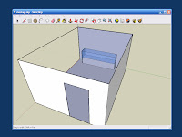
Try to get blueprints and photographs of the exhibit space if you can. If not, make sure to get enough measurements that you can reconstruct the space. For my made-up example, I'm going to say that my space is 15' x 20' with a 10' ceiling. There is a 4' x 8' entrance in one of the 15' walls, and where one of the 20' walls would be there is actually an opening leading into another gallery. I have a ceiling mounted LCD projector to display on the 20' wall, and a display case (10' long x 4' high x 2' deep) along the 15' wall without the door. There will also be a free-standing kiosk with a 2' x 2' footprint that is 5' high, which I can move to an appropriate location in the room.

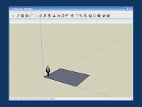
Given the dimensions of the space, we can use SketchUp to create a rudimentary 3D model. Start by using the Rectangle tool to draw the floor. To get the dimensions right, click on the origin and move the cursor into the plane, drawing a rectangle. You will see the dimensions in the lower right hand corner of the screen as you move the cursor. Type in 20', 15' and press Enter. The program should respond by drawing your floor. You can check your work with the Tape Measure tool to make sure the dimensions are right. Your mockup should look like this:


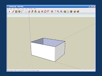
Now we want to create the basic volume of the space. Choose the Push/Pull tool (the one that looks like a block with a red arrow coming out the top), select the floor, hold down on the left mouse button and pull up a little bit. A cube should extrude upwards. Type in the distance (10') and press Enter. We'll want to be able to see into the space, so use the Arrow to select the top face of the cube, right click and choose Erase. If everything worked, you should see something like this:


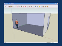
Since one of the 20' walls opens into another gallery, we can erase it, too. Use the Rectangle tool to draw a 4' x 8' entry way in one of the 15' walls and use Move to slide it into the right position if necessary. Use the Arrow to select the door, right click and Erase it. Click the Zoom to Extents tool (a magnifying glass with four red arrows) and then type 45 to get a 45-degree field of view. When you press Enter the mockup should look something like this:


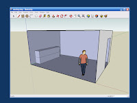
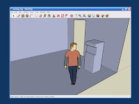
Now we want to create our display case. Unfortunately, the little dude who shows up by default is standing in the way. (His name is "Bryce.") Use the Arrow tool to select Bryce and then use Tools->Move to drag him out of the way. Now use the Rectangle tool to draw the 10' x 2' footprint of the display case along the wall. Use the Push/Pull tool to extrude it to a height of 4'. Since the top 2' of our display case is made of glass, we use the Pencil tool to draw a line around the midpoint of the case. The mockup now looks like this:


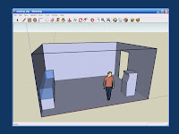
Next we use the Orbit tool to rotate the image around so that we can see the far side of the display case. Using the Paint tool, paint the top surface, and the left, front, and right top halves with transparent blue glass. Now that you can see into the case, it is obvious that we will need an internal platform to place artifacts on. Draw one with the Rectangle tool.


Next we create the kiosk. We use the Orbit and Zoom tools again to get a good view of where we want to put it. Draw the 2' x 2' footprint with the Rectangle tool, and then extrude it to a height of 5' with the Push/Pull tool. My imaginary kiosk looks a bit like a classic arcade-style video game. We use the Rectangle tool to draw a Golden Section on the front face, then the Push/Pull tool to push it in about 4".


This next bit is hard to describe, but easy enough once you get the hang of it. By selecting the horizontal lines on the front of the kiosk, we can use the Move tool to push them in or out gently, thus sculpting the front. If you do something too drastic, you can always Undo it. When finished, mine looked like this:


Next we want to place our LCD projector on the ceiling and indicate where the image will be projected. Rather than creating a projector model ourselves, we go to the Google 3D Warehouse and search for "projector". The one created by Rothmatic looks like what I had in mind, so we save it to disk and import it into the drawing.

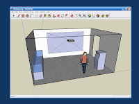
Use the Scale tool to make the projector the right size. Then Move it into the center of the ceiling and Rotate it to the right orientation. In this demonstration, I've just eyeballed it, but for a real exhibit you would want to know where the projector would be mounted, and how large and where exactly the image would be cast. You would want to make sure that most visitors wouldn't walk through the beam. You'd also have to worry about ambient lighting being high enough for comfort but not so high as to drown out the projected image. In the interests of pedagogy, however, we're making this up and simplifying as we go along. Use the Rectangle tool to draw the projected image on the wall, and the Pencil tool to draw lines from each corner of the projected image back to the projector lens. If all your lines connect, you will end up with a pyramid-shaped solid, as shown in the next image.


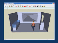
Now use the Arrow tool to select each face of the pyramid in turn, right-click and Erase them. Use the Paint tool to make the walls off-white, and the carpet gray. The final model should look like this:


We now have a basic 3D model which we can use to convey an impression of how the exhibit space will look. If you'd like to load the model into SketchUp and play with it, a copy is here. In the next part, we'll generate some screenshots of our space, and load them into The GIMP for further manipulation.

Tags: |

Friday, November 09, 2007

History Appliances: Laser Spirograph

A sure sign of a 1970s childhood is a fond memory of doodling with the Kenner Spirograph toy. In the back of my mind I've been thinking it would be fun to build something like it into a history appliance. You can already find software versions online, but I wanted something that could be used at the periphery, rather than the focus, of attention. On a recent trip to Active Surplus in Toronto I realized I could build a version quite cheaply. So here it is: a little too thrown together even to call a hack, this is really a kludge.

I started by cutting a $1 laser pointer out of its casing and soldering some wires to it so I could switch it on and off electronically. Here it is on a breadboard with a 5v voltage regulator.


The laser shines on a mirror that is crazy-glued to a cylindrical piece of dense foam and mounted on the shaft of a motor. I used Lego motors because I had a pair of them. The reflection bounces off another mirror, similarly mounted, and is projected on to a screen made from a 3x5 card. The motors tend to slip around when they are running so I put a rubber mat under each.


The motors are controlled by pulse width modulation, using a Phidgets MotorControl LV board. I used a wall wart to supply 9v for the motors.


To be able to fiddle with the speed of each motor, I used the Phidgets Interface Kit, the mini joystick and a Max/MSP patch.


The whole setup looked like this.


With the motors both running, the dot of the laser pointer is perturbed by first one rotation, then the next, tracing out a familiar spirograph-style image.


As you vary the speed and direction of rotation for the two mirrors, you get a range of different patterns.


To demonstrate, I used the joystick to vary the parameters of the system. In an application, it would be hooked up to streaming data instead. Groovy!

Tags: | | |